Matplotlib: Beyond the basics
Status and plan for today
By now you know the basics of:
- Numpy array creation and manipulation.
- Display of data in numpy arrays, sufficient for interactive exploratory work.
Hopefully after this notebook you will:
- Know how to polish those figures to the point where they can go to a journal.
- Understand matplotlib’s internal model enough to:
- know where to look for knobs to fine-tune
- better understand the help and examples online
- use it as a development platform for complex visualization
Resources
- The official matplotlib documentation is detailed and comprehensive. Particularly useful sections are:
- The gallery.
- The high level overview of its dual APIs, ``pyplot` and object-oriented <https://matplotlib.org/api/pyplot_summary.html>`__.
- The topical tutorials.
- A detailed tutorial by Nicolas Rougier, similar in style to the ones we saw for Numpy.
- The fantastic Python Graph Gallery, which provides a large collection of plots with emphasis on statistical visualizations. It uses Seaborn extensively.
- In this tutorial we’ll focus on “raw” matplotlib, but for a wide variety of statistical visualization tasks, using Seaborn makes life much easier. We’ll dive into its tutorial later on.
Matplotlib’s main APIs: pyplot and object-oriented
Matplotlib is a library that can be thought of as having two main ways of being used:
- via
pyplotcalls, as a high-level, matlab-like library that automatically manages details like figure creation. - via its internal object-oriented structure, that offers full control over all aspects of the figure, at the cost of slightly more verbose calls for the common case.
The pyplot api:
- Easiest to use.
- Sufficient for simple and moderately complex plots.
- Does not offer complete control over all details.
Before we look at our first simple example, we must activate matplotlib support in the notebook:
In [1]:
%matplotlib inline

import matplotlib.pyplot as plt
import numpy as np
# a few widely used tools from numpy
from numpy import sin, cos, exp, sqrt, pi, linspace, arange
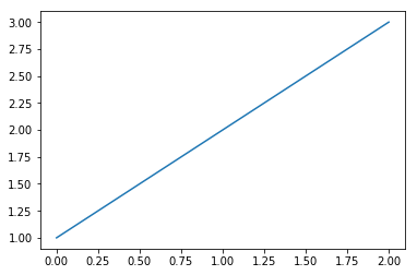
In [2]:
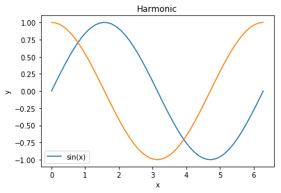
x = linspace(0, 2 * pi)
y = sin(x)
plt.plot(x, y, label='sin(x)')
plt.legend()
plt.title('Harmonic')
plt.xlabel('x')
plt.ylabel('y')
# Add one line to that plot
z = cos(x)
plt.plot(x, z, label='cos(x)')
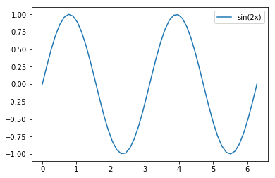
# Make a second figure with a simple plot
plt.figure()
plt.plot(x, sin(2*x), label='sin(2x)')
plt.legend();

Here is how to create the same two plots, using explicit management of the figure and axis objects:
In [3]:
f, ax = plt.subplots()  # we manually make a figure and axis
ax.plot(x,y, label='sin(x)')  # it's the axis who plots
ax.legend()
ax.set_title('Harmonic')  # we set the title on the axis
ax.set_xlabel('x')  # same with labels
ax.set_ylabel('y')

# Make a second figure with a simple plot.  We can name the figure with a
# different variable name as well as its axes, and then control each
f1, ax1 = plt.subplots()
ax1.plot(x, sin(2*x), label='sin(2x)')
ax1.legend()

# Since we now have variables for each axis, we can add back to the first
# figure even after making the second
ax.plot(x, z, label='cos(x)');

It’s important to understand the existence of these objects, even if you use mostly the top-level pyplot calls most of the time. Many things can be accomplished in MPL with mostly pyplot and a little bit of tweaking of the underlying objects. We’ll revisit the object-oriented API later.
Important commands to know about, and which matplotlib uses internally a lot:
gcf()  # get current figure
gca()  # get current axis
Making subplots
The simplest command is:
f, ax = plt.subplots()
which is equivalent to:
f = plt.figure()
ax = f.add_subplot(111)
By passing arguments to subplots, you can easily create a regular
plot grid:
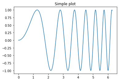
In [4]:
x = linspace(0, 2*pi, 400)
y = sin(x**2)
# Just a figure and one subplot
f, ax = plt.subplots()
ax.plot(x, y)
ax.set_title('Simple plot')
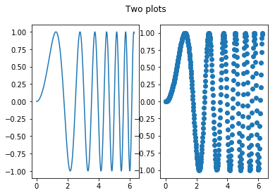
# Two subplots, unpack the output array immediately
f, (ax1, ax2) = plt.subplots(1, 2)
ax1.plot(x, y)
ax2.scatter(x, y)
# Put a figure-level title
f.suptitle('Two plots');
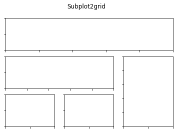
And finally, an arbitrarily complex grid can be made with
subplot2grid:
In [5]:
f = plt.figure()
ax1 = plt.subplot2grid((3,3), (0,0), colspan=3)
ax2 = plt.subplot2grid((3,3), (1,0), colspan=2)
ax3 = plt.subplot2grid((3,3), (1, 2), rowspan=2)
ax4 = plt.subplot2grid((3,3), (2, 0))
ax5 = plt.subplot2grid((3,3), (2, 1))

# Let's turn off visibility of all tick labels here
for ax in f.axes:
   for t in ax.get_xticklabels()+ax.get_yticklabels():
       t.set_visible(False)

# And add a figure-level title at the top
f.suptitle('Subplot2grid');
Manipulating properties across matplotlib
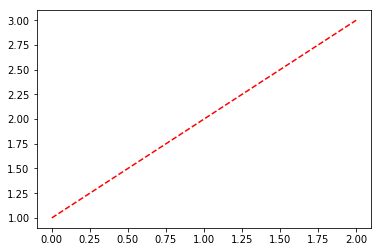
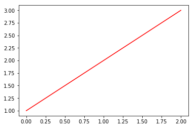
In matplotlib, most properties for lines, colors, etc, can be set directly in the call:
In [6]:
plt.plot([1,2,3], linestyle='--', color='r')
Out[6]:
[<matplotlib.lines.Line2D at 0x1156e53c8>]
But for finer control you can get a hold of the returned line object (more on these objects later):
In [1]: line, = plot([1,2,3])
These line objects have a lot of properties you can control, a full list is seen here by tab-completing in IPython:
In [2]: line.set
line.set                     line.set_drawstyle           line.set_mec
line.set_aa                  line.set_figure              line.set_mew
line.set_agg_filter          line.set_fillstyle           line.set_mfc
line.set_alpha               line.set_gid                 line.set_mfcalt
line.set_animated            line.set_label               line.set_ms
line.set_antialiased         line.set_linestyle           line.set_picker
line.set_axes                line.set_linewidth           line.set_pickradius
line.set_c                   line.set_lod                 line.set_rasterized
line.set_clip_box            line.set_ls                  line.set_snap
line.set_clip_on             line.set_lw                  line.set_solid_capstyle
line.set_clip_path           line.set_marker              line.set_solid_joinstyle
line.set_color               line.set_markeredgecolor     line.set_transform
line.set_contains            line.set_markeredgewidth     line.set_url
line.set_dash_capstyle       line.set_markerfacecolor     line.set_visible
line.set_dashes              line.set_markerfacecoloralt  line.set_xdata
line.set_dash_joinstyle      line.set_markersize          line.set_ydata
line.set_data                line.set_markevery           line.set_zorder
But the setp call (short for set property) can be very useful,
especially while working interactively because it contains introspection
support, so you can learn about the valid calls as you work:
In [7]: line, = plot([1,2,3])

In [8]: setp(line, 'linestyle')
  linestyle: [ ``'-'`` | ``'--'`` | ``'-.'`` | ``':'`` | ``'None'`` | ``' '`` | ``''`` ]         and any drawstyle in combination with a linestyle, e.g. ``'steps--'``.

In [9]: setp(line)
  agg_filter: unknown
  alpha: float (0.0 transparent through 1.0 opaque)
  animated: [True | False]
  antialiased or aa: [True | False]
  ...
  ... much more output elided
  ...
In the first form, it shows you the valid values for the ‘linestyle’ property, and in the second it shows you all the acceptable properties you can set on the line object. This makes it very easy to discover how to customize your figures to get the visual results you need.
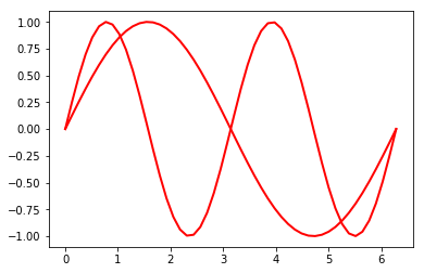
Furthermore, setp can manipulate multiple objects at a time:
In [7]:
x = linspace(0, 2*pi)
y1 = sin(x)
y2 = sin(2*x)
lines = plt.plot(x, y1, x, y2)

# We will set the width and color of all lines in the figure at once:
plt.setp(lines, linewidth=2, color='r')
Out[7]:
[None, None, None, None]
Finally, if you know what properties you want to set on a specific
object, a plain set call is typically the simplest form:
In [8]:
line, = plt.plot([1,2,3])
line.set(lw=2, c='red',ls='--')
Out[8]:
[None, None, None]
Understanding what matplotlib returns: lines, axes and figures
Lines
In a simple plot:
In [9]:
plt.plot([1,2,3])
Out[9]:
[<matplotlib.lines.Line2D at 0x115310c18>]
The return value of the plot call is a list of lines, which can be manipulated further. If you capture the line object (in this case it’s a single line so we use a one-element tuple):
In [10]:
line, = plt.plot([1,2,3])
line.set_color('r')
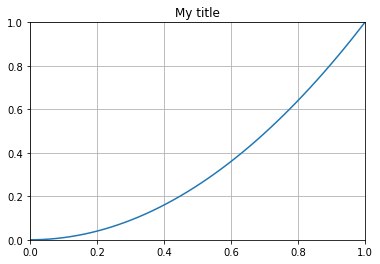
One line property that is particularly useful to be aware of is
set_data:
In [11]:
# Create a plot and hold the line object
line, = plt.plot([1,2,3], label='my data')
plt.grid()
plt.title('My title')

# ... later, we may want to modify the x/y data but keeping the rest of the
# figure intact, with our new data:
x = linspace(0, 1)
y = x**2

# This can be done by operating on the data object itself
line.set_data(x, y)

# Now we must set the axis limits manually. Note that we can also use xlim
# and ylim to set the x/y limits separately.
plt.axis([0,1,0,1])

# Note, alternatively this can be done with:
ax = plt.gca()  # get currently active axis object
ax.relim()
ax.autoscale_view()

# as well as requesting matplotlib to draw
plt.draw()
The next important component, axes
The axis call above was used to set the x/y limits of the axis. And
in previous examples we called .plot directly on axis objects. Axes
are the main object that contains a lot of the user-facing functionality
of matplotlib:
In [15]: f = plt.figure()

In [16]: ax = f.add_subplot(111)

In [17]: ax.
Display all 299 possibilities? (y or n)
ax.acorr                                 ax.hitlist
ax.add_artist                            ax.hlines
ax.add_callback                          ax.hold
ax.add_collection                        ax.ignore_existing_data_limits
ax.add_line                              ax.images
ax.add_patch                             ax.imshow

... etc.
Many of the commands in plt.<command> are nothing but wrappers
around axis calls, with machinery to automatically create a figure and
add an axis to it if there wasn’t one to begin with. The output of most
axis actions that draw something is a collection of lines (or other more
complex geometric objects).
Enclosing it all, the figure
The enclosing object is the figure, that holds all axes:
In [17]: f = plt.figure()

In [18]: f.add_subplot(211)
Out[18]: <matplotlib.axes.AxesSubplot object at 0x9d0060c>

In [19]: f.axes
Out[19]: [<matplotlib.axes.AxesSubplot object at 0x9d0060c>]

In [20]: f.add_subplot(212)
Out[20]: <matplotlib.axes.AxesSubplot object at 0x9eacf0c>

In [21]: f.axes
Out[21]:
[<matplotlib.axes.AxesSubplot object at 0x9d0060c>,
 <matplotlib.axes.AxesSubplot object at 0x9eacf0c>]
The basic view of matplotlib is: a figure contains one or more axes, axes draw and return collections of one or more geometric objects (lines, patches, etc).
For all the gory details on this topic, see the matplotlib artist tutorial.
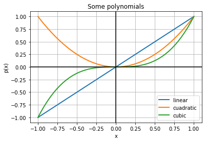
Anatomy of a common plot
Let’s make a simple plot that contains a few commonly used decorations
In [12]:
f, ax = plt.subplots()

# Three simple polyniomials
x = linspace(-1, 1)
y1,y2,y3 = [x**i for i in [1,2,3]]

# Plot each with a label (for a legend)
ax.plot(x, y1, label='linear')
ax.plot(x, y2, label='cuadratic')
ax.plot(x, y3, label='cubic')
# Make all lines drawn so far thicker
plt.setp(ax.lines, linewidth=2)

# Add a grid and a legend that doesn't overlap the lines
ax.grid(True)
ax.legend(loc='lower right')

# Add black horizontal and vertical lines through the origin
ax.axhline(0, color='black')
ax.axvline(0, color='black')

# Set main text elements of the plot
ax.set_title('Some polynomials')
ax.set_xlabel('x')
ax.set_ylabel('p(x)')
Out[12]:
Text(0,0.5,'p(x)')
Common plot types
Error plots
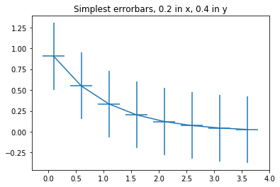
First a very simple error plot
In [13]:
# example data
x = arange(0.1, 4, 0.5)
y = exp(-x)

# example variable error bar values
yerr = 0.1 + 0.2*sqrt(x)
xerr = 0.1 + yerr

# First illustrate basic pyplot interface, using defaults where possible.
plt.figure()
plt.errorbar(x, y, xerr=0.2, yerr=0.4)
plt.title("Simplest errorbars, 0.2 in x, 0.4 in y")
Out[13]:
Text(0.5,1,'Simplest errorbars, 0.2 in x, 0.4 in y')
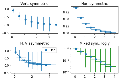
Now a more elaborate one, using the OO interface to exercise more features.
In [14]:
# same data/errors as before
x = arange(0.1, 4, 0.5)
y = exp(-x)
yerr = 0.1 + 0.2*sqrt(x)
xerr = 0.1 + yerr

fig, axs = plt.subplots(nrows=2, ncols=2)
ax = axs[0,0]
ax.errorbar(x, y, yerr=yerr, fmt='o')
ax.set_title('Vert. symmetric')

# With 4 subplots, reduce the number of axis ticks to avoid crowding.
ax.locator_params(nbins=4)

ax = axs[0,1]
ax.errorbar(x, y, xerr=xerr, fmt='o')
ax.set_title('Hor. symmetric')

ax = axs[1,0]
ax.errorbar(x, y, yerr=[yerr, 2*yerr], xerr=[xerr, 2*xerr], fmt='--o', label='foo')
ax.legend()
ax.set_title('H, V asymmetric')

ax = axs[1,1]
ax.set_yscale('log')
# Here we have to be careful to keep all y values positive:
ylower = np.maximum(1e-2, y - yerr)
yerr_lower = y - ylower

ax.errorbar(x, y, yerr=[yerr_lower, 2*yerr], xerr=xerr,
                             fmt='o', ecolor='g')
ax.set_title('Mixed sym., log y')

# Fix layout to minimize overlap between titles and marks
# https://matplotlib.org/users/tight_layout_guide.html
plt.tight_layout()
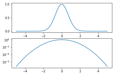
Logarithmic plots
A simple log plot
In [15]:
x = linspace(-5, 5)
y = exp(-x**2)

f, (ax1, ax2) = plt.subplots(2, 1)
ax1.plot(x, y)
ax2.semilogy(x, y)
Out[15]:
[<matplotlib.lines.Line2D at 0x115235e48>]
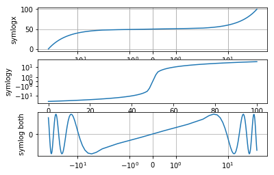
A more elaborate log plot using ‘symlog’, that treats a specified range as linear (thus handling values near zero) and symmetrizes negative values:
In [16]:
x = linspace(-50, 50, 100)
y = linspace(0, 100, 100)

# Create the figure and axes
f, (ax1, ax2, ax3) = plt.subplots(3, 1)

# Symlog on the x axis
ax1.plot(x, y)
ax1.set_xscale('symlog')
ax1.set_ylabel('symlogx')
# Grid for both axes
ax1.grid(True)
# Minor grid on too for x
ax1.xaxis.grid(True, which='minor')

# Symlog on the y axis
ax2.plot(y, x)
ax2.set_yscale('symlog')
ax2.set_ylabel('symlogy')

# Symlog on both
ax3.plot(x, sin(x / 3.0))
ax3.set_xscale('symlog')
ax3.set_yscale('symlog')
ax3.grid(True)
ax3.set_ylabel('symlog both')
Out[16]:
Text(0,0.5,'symlog both')
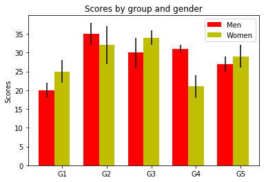
Bar plots
In [17]:
# a bar plot with errorbars
import numpy as np
import matplotlib.pyplot as plt

N = 5
menMeans = (20, 35, 30, 31, 27)
menStd =   (2, 3, 4, 1, 2)

ind = arange(N)  # the x locations for the groups
width = 0.35       # the width of the bars

fig = plt.figure()
ax = fig.add_subplot(111)
rects1 = ax.bar(ind, menMeans, width, color='r', yerr=menStd)

womenMeans = (25, 32, 34, 21, 29)
womenStd =   (3, 5, 2, 3, 3)
rects2 = ax.bar(ind+width, womenMeans, width, color='y', yerr=womenStd)

# add some
ax.set_ylabel('Scores')
ax.set_title('Scores by group and gender')
ax.set_xticks(ind+width)
ax.set_xticklabels( ('G1', 'G2', 'G3', 'G4', 'G5') )

ax.legend( (rects1[0], rects2[0]), ('Men', 'Women') )
Out[17]:
<matplotlib.legend.Legend at 0x115e43ef0>
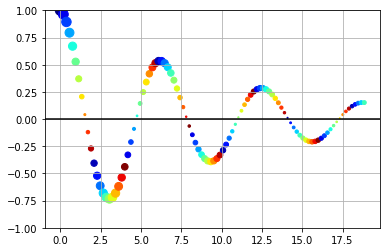
Scatter plots
The scatter command produces scatter plots with arbitrary markers.
In [18]:
from matplotlib import cm

t = linspace(0.0, 6*pi, 100)
y = exp(-0.1*t)*cos(t)
phase = t % 2*pi
f = plt.figure()
ax = f.add_subplot(111)
ax.scatter(t, y, s=100*abs(y), c=phase, cmap=cm.jet)
ax.set_ylim(-1,1)
ax.grid()
ax.axhline(0, color='k')
Out[18]:
<matplotlib.lines.Line2D at 0x115ebacc0>
Exercise
Consider you have the following data in a text file (The file
data/stations.txt contains the full dataset):
# Station  Lat    Long   Elev
BIRA    26.4840 87.2670 0.0120
BUNG    27.8771 85.8909 1.1910
GAIG    26.8380 86.6318 0.1660
HILE    27.0482 87.3242 2.0880
... etc.
These are the names of seismographic stations in the Himalaya, with their coordinates and elevations in Kilometers.
- Make a scatter plot of all of these, using both the size and the color to (redundantly) encode elevation. Label each station by its 4-letter code, and add a colorbar on the right that shows the color-elevation map.
- If you have the basemap toolkit installed, repeat the same exercise
but draw a grid with parallels and meridians, add rivers in cyan and
country boundaries in yellow. Also, draw the background using the
NASA BlueMarble image of Earth. You can install it with
conda install basemap.
Tips
You can check whether you have Basemap installed with:
from mpl_toolkits.basemap import Basemap
For the basemap part, choose a text label color that provides adequate reading contrast over the image background.
Create your Basemap with ‘i’ resolution, otherwise it will take forever to draw.
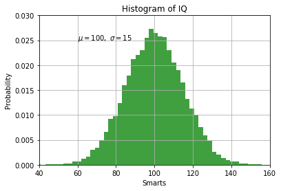
Histograms
Matplotlib has a built-in command for histograms.
In [19]:
mu, sigma = 100, 15
x = mu + sigma * np.random.randn(10000)

# the histogram of the data
n, bins, patches = plt.hist(x, 50, normed=1, facecolor='g', alpha=0.75)

plt.xlabel('Smarts')
plt.ylabel('Probability')
plt.title('Histogram of IQ')
plt.text(60, .025, r'$\mu=100,\ \sigma=15$')
plt.axis([40, 160, 0, 0.03])
plt.grid(True)
Aribitrary text and LaTeX support
In matplotlib, text can be added either relative to an individual axis object or to the whole figure.
These commands add text to the Axes:
- title() - add a title
- xlabel() - add an axis label to the x-axis
- ylabel() - add an axis label to the y-axis
- text() - add text at an arbitrary location
- annotate() - add an annotation, with optional arrow
And these act on the whole figure:
- figtext() - add text at an arbitrary location
- suptitle() - add a title
And any text field can contain LaTeX expressions for mathematics, as
long as they are enclosed in $ signs.
This example illustrates all of them:
In [20]:
fig = plt.figure()
fig.suptitle('bold figure suptitle', fontsize=14, fontweight='bold')

ax = fig.add_subplot(111)
fig.subplots_adjust(top=0.85)
ax.set_title('axes title')

ax.set_xlabel('xlabel')
ax.set_ylabel('ylabel')

ax.text(3, 8, 'boxed italics text in data coords', style='italic',
        bbox={'facecolor':'red', 'alpha':0.5, 'pad':10})

ax.text(2, 6, r'an equation: $E=mc^2$', fontsize=15)

ax.text(3, 2, 'unicode: Institut für Festkörperphysik')

ax.text(0.95, 0.01, 'colored text in axes coords',
        verticalalignment='bottom', horizontalalignment='right',
        transform=ax.transAxes,
        color='green', fontsize=15)


ax.plot([2], [1], 'o')
ax.annotate('annotate', xy=(2, 1), xytext=(3, 4),
            arrowprops=dict(facecolor='black', shrink=0.05))

ax.axis([0, 10, 0, 10])
Out[20]:
[0, 10, 0, 10]
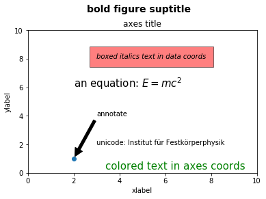
Image display
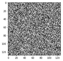
The imshow command can display single or multi-channel images. A
simple array of random numbers, plotted in grayscale:
In [21]:
from matplotlib import cm
plt.imshow(np.random.rand(128, 128), cmap=cm.gray, interpolation='nearest')
Out[21]:
<matplotlib.image.AxesImage at 0x115bbe1d0>
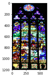
A real photograph is a multichannel image, imshow interprets it
correctly:
In [22]:
img = plt.imread('data/stained_glass_barcelona.png')
plt.imshow(img)
Out[22]:
<matplotlib.image.AxesImage at 0x11631d6d8>
Exercise
Write a notebook where you can load an image and then perform the following operations on it:
- Create a figure with four plots that show both the full-color image and color channel of the image with the right colormap for that color. Ensure that the axes are linked so zooming in one image zooms the same region in the others.
- Compute a luminosity and per-channel histogram and display all four histograms in one figure, giving each a separate plot (hint: a 4x1 plot works best for this). Link the appropriate axes together.
- Create a black-and-white (or more precisely, grayscale) version of the image. Compare the results from a naive average of all three channels with that of a model that uses 30% red, 59% green and 11% blue, by displaying all three (full color and both grayscales) side by side with linked axes for zooming.
Hint: look for the matplotlib image tutorial.