Lab 9
Seaborn: Statistical Graphics in Python
So far we’ve learned how to create high quality charts with
matplotlib. Using the object oriented API we can customize aspects
of our plots and create anything. However, in statistics and data
science there are some types of charts that we always make, and for
those there’s seaborn.
seaborn is a statistical plotting package built on top of
mmatplotlib which incorporates pandas in its design. Like
matplotlib, seaborn has an example
gallery with many
great charts and the code to make them. The structure of this lab is
based on the `seaborn tutorial in the
documentation <https://seaborn.pydata.org/tutorial.html>`__
First, we need data. We’ll be using data from a Fivethirtyeight article
on the political leanings of NFL
fans
that you can find on
Github.
I’ve renamed the files and put them under the data directory.
In [1]:
import numpy as np
import pandas as pd
import matplotlib.pyplot as plt
%matplotlib inline
The dataset in data/fivethirtyeight-nfl-google.csv has aggregated
search interest data for various sports leagues in each market, as well
as Trump’s share of the vote in that market.
In [2]:
# load the data
nfl_trends = pd.read_csv("data/fivethirtyeight-nfl-google.csv", header=1)
nfl_trends.head()
Out[2]:
| DMA | NFL | NBA | MLB | NHL | NASCAR | CBB | CFB | Trump 2016 Vote% | |
|---|---|---|---|---|---|---|---|---|---|
| 0 | Abilene-Sweetwater TX | 45% | 21% | 14% | 2% | 4% | 3% | 11% | 79.13% |
| 1 | Albany GA | 32% | 30% | 9% | 1% | 8% | 3% | 17% | 59.12% |
| 2 | Albany-Schenectady-Troy NY | 40% | 20% | 20% | 8% | 6% | 3% | 4% | 44.11% |
| 3 | Albuquerque-Santa Fe NM | 53% | 21% | 11% | 3% | 3% | 4% | 6% | 39.58% |
| 4 | Alexandria LA | 42% | 28% | 9% | 1% | 5% | 3% | 12% | 69.64% |
In [3]:
# convert percent strings into floats
numeric_data = (nfl_trends.iloc[:,1:]
                .replace("%", "",regex=True)
                .astype(float))
numeric_data["DMA"] = nfl_trends["DMA"]
nfl_trends = numeric_data
As soon as we import seaborn, we notice a change.
In [4]:
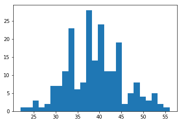
plt.hist(nfl_trends["NFL"], bins=25);
In [5]:
import seaborn as sns
plt.hist(nfl_trends["NFL"], bins=25);
/home/ebenmichael/anaconda3/lib/python3.6/site-packages/matplotlib/font_manager.py:1297: UserWarning: findfont: Font family ['sans-serif'] not found. Falling back to DejaVu Sans
  (prop.get_family(), self.defaultFamily[fontext]))
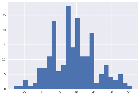
Seaborn has several default styles that we can set with a context
In [6]:
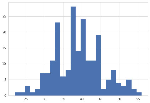
with sns.axes_style("whitegrid"):
    plt.hist(nfl_trends["NFL"], bins=25);
/home/ebenmichael/anaconda3/lib/python3.6/site-packages/matplotlib/font_manager.py:1297: UserWarning: findfont: Font family ['sans-serif'] not found. Falling back to DejaVu Sans
  (prop.get_family(), self.defaultFamily[fontext]))
In [7]:
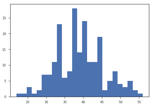
with sns.axes_style("ticks"):
    plt.hist(nfl_trends["NFL"], bins=25);
/home/ebenmichael/anaconda3/lib/python3.6/site-packages/matplotlib/font_manager.py:1297: UserWarning: findfont: Font family ['sans-serif'] not found. Falling back to DejaVu Sans
  (prop.get_family(), self.defaultFamily[fontext]))
In [8]:
with sns.axes_style("whitegrid"):
    plt.hist(nfl_trends["NFL"], bins=25)
    sns.despine()
/home/ebenmichael/anaconda3/lib/python3.6/site-packages/matplotlib/font_manager.py:1297: UserWarning: findfont: Font family ['sans-serif'] not found. Falling back to DejaVu Sans
  (prop.get_family(), self.defaultFamily[fontext]))

We can set the style for the whole session as well.
In [9]:
sns.set_style("whitegrid")
Plotting Distributions
Univariate Distributions
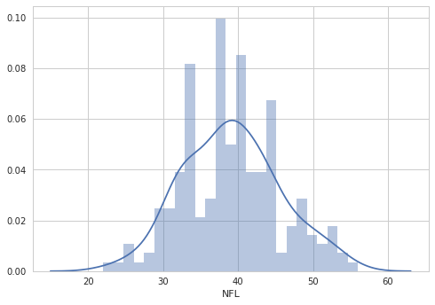
How does search interest in the NFL vary across markets? To explore this
we want to see the distribution of NFL interest in our dataset. In
matplotlib we can do this with the histogram above. seaborn
builds off of the histograms in matplotlib and adds more ways to
visualize the distribution with the displot function.
In [10]:
sns.distplot(nfl_trends["NFL"], bins=25);
/home/ebenmichael/anaconda3/lib/python3.6/site-packages/matplotlib/font_manager.py:1297: UserWarning: findfont: Font family ['sans-serif'] not found. Falling back to DejaVu Sans
  (prop.get_family(), self.defaultFamily[fontext]))
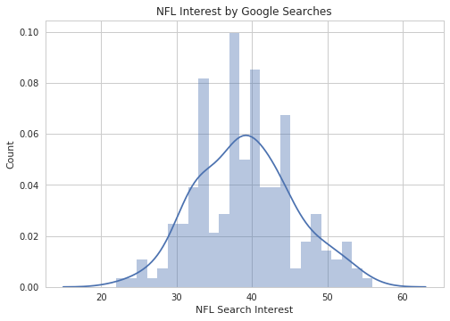
We can incorporate seaborn plotting functions into the object
oriented matplotlib api.
In [11]:
fig, ax = plt.subplots(1, 1)
ax = sns.distplot(nfl_trends["NFL"], bins=25, ax=ax);
ax.set_title("NFL Interest by Google Searches")
ax.set_xlabel("NFL Search Interest")
ax.set_ylabel("Count")
Out[11]:
<matplotlib.text.Text at 0x7f73a93a49b0>
/home/ebenmichael/anaconda3/lib/python3.6/site-packages/matplotlib/font_manager.py:1297: UserWarning: findfont: Font family ['sans-serif'] not found. Falling back to DejaVu Sans
  (prop.get_family(), self.defaultFamily[fontext]))
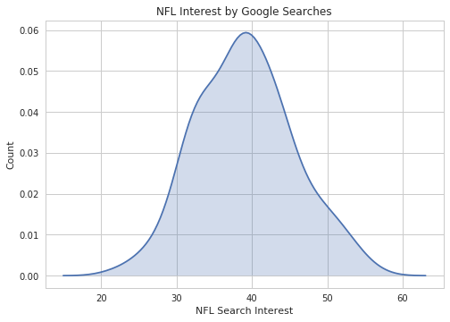
distplot has many options, and I encourage you to read the
documentation
to see all of them.
For instance, we can just plot the kernel density estimate:
In [12]:
ax = sns.distplot(nfl_trends["NFL"], hist=False, kde_kws={"shade":True});
ax.set_title("NFL Interest by Google Searches")
ax.set_xlabel("NFL Search Interest")
ax.set_ylabel("Count")
Out[12]:
<matplotlib.text.Text at 0x7f73a91e6dd8>
/home/ebenmichael/anaconda3/lib/python3.6/site-packages/matplotlib/font_manager.py:1297: UserWarning: findfont: Font family ['sans-serif'] not found. Falling back to DejaVu Sans
  (prop.get_family(), self.defaultFamily[fontext]))
Or plot the kernel density estimate with ticks for each data point:
In [13]:
ax = sns.distplot(nfl_trends["NFL"], hist=False,
                  rug=True, kde_kws={"shade":True});
ax.set_title("NFL Interest by Google Searches")
ax.set_xlabel("NFL Search Interest")
ax.set_ylabel("Count")
Out[13]:
<matplotlib.text.Text at 0x7f73a9383940>
/home/ebenmichael/anaconda3/lib/python3.6/site-packages/matplotlib/font_manager.py:1297: UserWarning: findfont: Font family ['sans-serif'] not found. Falling back to DejaVu Sans
  (prop.get_family(), self.defaultFamily[fontext]))
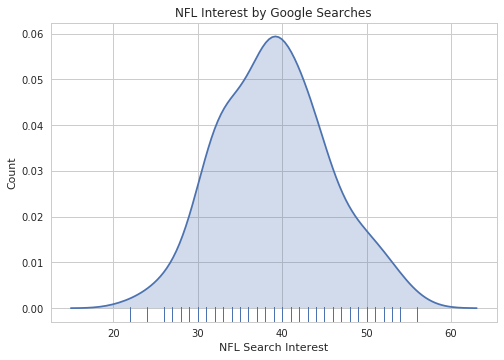
Notice that we passed in a dictionary called kde_kws. seaborn
also has individual functions to plot a kernel density estimate or a rug
plot, which the higher level distplot function uses. In general, to
pass arguments into these lower level functions, you’ll need to pass in
a dictionary of arguments for those functions.
Bivariate Distributions
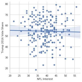
A few weeks ago, Donald Trump picked a fight with NFL players kneeling during the national anthem to protest police brutality and racial inequality. Is support for the NFL polarized across party lines? We can use Google search interest in the NFL to examine this relationship.
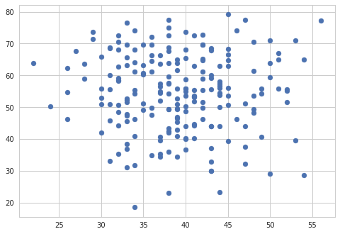
The most straightforward way to plot a bivariate distribution is a simple scatterplot.
In [14]:
plt.scatter(nfl_trends["NFL"], nfl_trends["Trump 2016 Vote%"]);
/home/ebenmichael/anaconda3/lib/python3.6/site-packages/matplotlib/font_manager.py:1297: UserWarning: findfont: Font family ['sans-serif'] not found. Falling back to DejaVu Sans
  (prop.get_family(), self.defaultFamily[fontext]))
If we want more information on our plot, the jointplot function in
seaborn has various ways to visualize a bivariate distribution.
Instead of just taking in a numpy array or a pandas Series
object, this function (and most seaborn functions) take in full
pandas DataFrames. We can then select what variables to plot in the
function. If you use ggplot2 in R, this style should seem somewhat
familiar.
We can make this scatterplot along with the marginal histograms with
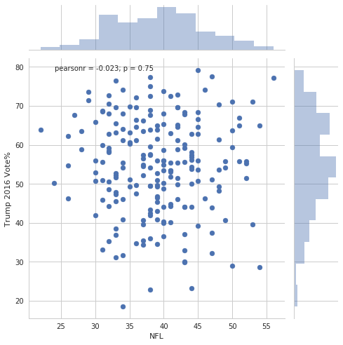
jointplot.
In [15]:
sns.jointplot(data=nfl_trends, x="NFL", y="Trump 2016 Vote%",
              size=7);
/home/ebenmichael/anaconda3/lib/python3.6/site-packages/matplotlib/font_manager.py:1297: UserWarning: findfont: Font family ['sans-serif'] not found. Falling back to DejaVu Sans
  (prop.get_family(), self.defaultFamily[fontext]))
Again, there are all sorts of options we can add.
In [16]:
sns.jointplot(data=nfl_trends, x="NFL", y="Trump 2016 Vote%",
              kind="reg", size=7);
/home/ebenmichael/anaconda3/lib/python3.6/site-packages/matplotlib/font_manager.py:1297: UserWarning: findfont: Font family ['sans-serif'] not found. Falling back to DejaVu Sans
  (prop.get_family(), self.defaultFamily[fontext]))
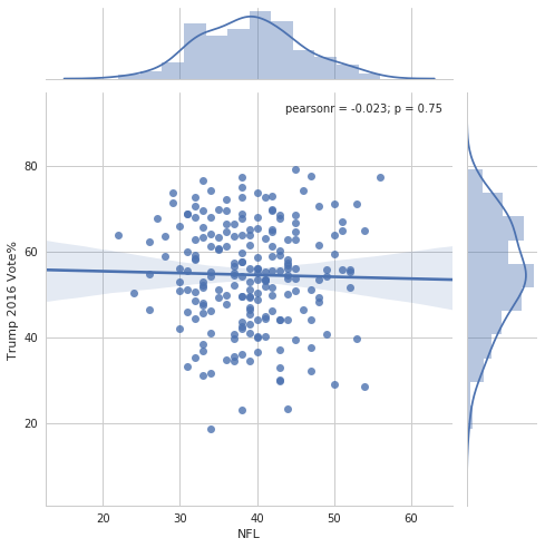
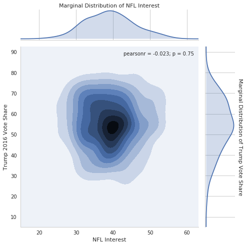
This plot lets us both visualize the distribution and see a summary statistic and it’s \(p\)-value (question: what does this \(p\)-value mean?). With all this information, it looks like there isn’t much of a relationship between interest in the NFL and support for Trump in 2016. This is evidence that the NFL is broadly popular among all Americans, and isn’t polarized.
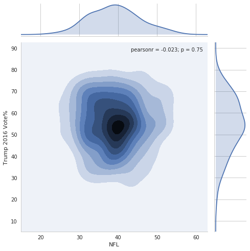
We can also look at a kernel density estimate of the distribution.
In [17]:
sns.jointplot(data=nfl_trends, x="NFL", y="Trump 2016 Vote%",
              kind="kde", size=7);
/home/ebenmichael/anaconda3/lib/python3.6/site-packages/matplotlib/font_manager.py:1297: UserWarning: findfont: Font family ['sans-serif'] not found. Falling back to DejaVu Sans
  (prop.get_family(), self.defaultFamily[fontext]))
Note that it’s possible to grab the output of the function as a
`JointGrid
object <https://seaborn.pydata.org/generated/seaborn.JointGrid.html#seaborn.JointGrid>`__
and customize it further.
In [18]:
# make plot
g = sns.jointplot(data=nfl_trends, x="NFL", y="Trump 2016 Vote%",
              kind="kde", size=7);

# change x/y labels on the two axes that hold the marginal distriubtions
g.set_axis_labels("NFL Interest", "Trump 2016 Vote Share")
g.ax_marg_x.set_xlabel("Marginal Distribution of NFL Interest")
g.ax_marg_x.xaxis.set_label_position("top")

g.ax_marg_y.set_ylabel("Marginal Distribution of Trump Vote Share",
                      rotation=270, labelpad=15)
g.ax_marg_y.yaxis.set_label_position("right")
plt.tight_layout()
/home/ebenmichael/anaconda3/lib/python3.6/site-packages/matplotlib/font_manager.py:1297: UserWarning: findfont: Font family ['sans-serif'] not found. Falling back to DejaVu Sans
  (prop.get_family(), self.defaultFamily[fontext]))
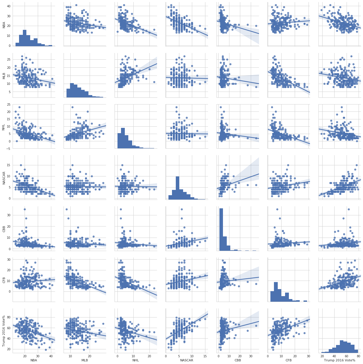
Finally, we can look at the pairwise distributions of all variables together.
In [19]:
sns.pairplot(nfl_trends.iloc[:,1:], kind="reg");
/home/ebenmichael/anaconda3/lib/python3.6/site-packages/matplotlib/font_manager.py:1297: UserWarning: findfont: Font family ['sans-serif'] not found. Falling back to DejaVu Sans
  (prop.get_family(), self.defaultFamily[fontext]))
Plotting Categorical Data
We’ve looked at the distribution of NFL interest across markets. It’s
interesting to see if the distributions for the the other sports leagues
are different. We could make a separate plot for each league, but
seaborn gives us the tools to put all the distributions on one plot.
To do this, we need to convert our data from a “wide” format where every
league has its own column, to a “long” format where there are only 3
columns. The melt function in pandas provides a utility to
convert to a long format.
In [20]:
nfl_melted = nfl_trends.melt("DMA")
nfl_melted.head()
Out[20]:
| DMA | variable | value | |
|---|---|---|---|
| 0 | Abilene-Sweetwater TX | NFL | 45.0 |
| 1 | Albany GA | NFL | 32.0 |
| 2 | Albany-Schenectady-Troy NY | NFL | 40.0 |
| 3 | Albuquerque-Santa Fe NM | NFL | 53.0 |
| 4 | Alexandria LA | NFL | 42.0 |
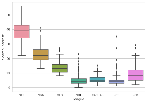
With our data in a long format we can evaluate the difference in the distributions. A classic plot to compare distributions is a box plot
In [21]:
# get rid of trump vote share to only have data on leagues
no_trump = nfl_melted[~nfl_melted["variable"].str.contains("Trump")]
sns.boxplot(data=no_trump, x="variable", y="value")
plt.xlabel("League")
plt.ylabel("Search Interest");
/home/ebenmichael/anaconda3/lib/python3.6/site-packages/matplotlib/font_manager.py:1297: UserWarning: findfont: Font family ['sans-serif'] not found. Falling back to DejaVu Sans
  (prop.get_family(), self.defaultFamily[fontext]))
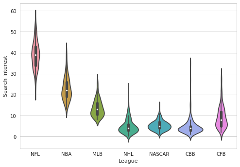
A more modern plot is a “Violin” plot, which embeds a boxplot in a kernel density estimate plot.
In [22]:
sns.violinplot(data=no_trump, x="variable", y="value")
plt.xlabel("League")
plt.ylabel("Search Interest");
/home/ebenmichael/anaconda3/lib/python3.6/site-packages/matplotlib/font_manager.py:1297: UserWarning: findfont: Font family ['sans-serif'] not found. Falling back to DejaVu Sans
  (prop.get_family(), self.defaultFamily[fontext]))
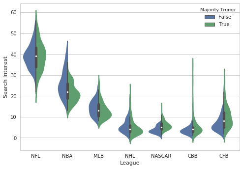
We can also compare the distribution for each league in states where Trump did and did not win a majority.
In [23]:
nfl_trends["Majority Trump"] = nfl_trends["Trump 2016 Vote%"] > 50
nfl_melted = nfl_trends.melt(["DMA", "Majority Trump"])
nfl_melted.head()
Out[23]:
| DMA | Majority Trump | variable | value | |
|---|---|---|---|---|
| 0 | Abilene-Sweetwater TX | True | NFL | 45.0 |
| 1 | Albany GA | True | NFL | 32.0 |
| 2 | Albany-Schenectady-Troy NY | False | NFL | 40.0 |
| 3 | Albuquerque-Santa Fe NM | False | NFL | 53.0 |
| 4 | Alexandria LA | True | NFL | 42.0 |
In [24]:
no_trump = nfl_melted[~nfl_melted["variable"].str.contains("Trump")]
sns.violinplot(data=no_trump, x="variable", y="value",
               hue="Majority Trump", split=True)
plt.xlabel("League")
plt.ylabel("Search Interest");
/home/ebenmichael/anaconda3/lib/python3.6/site-packages/matplotlib/font_manager.py:1297: UserWarning: findfont: Font family ['sans-serif'] not found. Falling back to DejaVu Sans
  (prop.get_family(), self.defaultFamily[fontext]))
There are many more types of categorical plots you can make. A great resource is the tutorial in the documentation.
For exercises we’ll be using a different dataset, also from the same
article. data/fiverthirtyeight-nfl-fan.csv contains information on
the number of fans who identify as as Republicans, Democrats, or
Independents by race. We’ll just look at the aggregate numbers which
show the percentage of Republicans, Democrats, and Independents, as well
as the percentage of responders who identify as white and non-white.
In [25]:
all_fans = pd.read_csv("data/fivethirtyeight-nfl-fan.csv", header=1)
# only keep aggregates
small_fans = all_fans[["Team","GOP%", "Dem%", "Ind%", "White%", "Nonwhite%"]]

# convert percent strings into floats
numeric_data = (small_fans.iloc[:,1:]
                .replace("%", "",regex=True)
                .astype(float))
numeric_data["Team"] = small_fans["Team"]
small_fans = numeric_data
small_fans.head()
Out[25]:
| GOP% | Dem% | Ind% | White% | Nonwhite% | Team | |
|---|---|---|---|---|---|---|
| 0 | 26.0 | 26.0 | 48.0 | 68.0 | 32.0 | Arizona Cardinals |
| 1 | 29.0 | 31.0 | 40.0 | 57.0 | 43.0 | Atlanta Falcons |
| 2 | 19.0 | 37.0 | 43.0 | 68.0 | 32.0 | Baltimore Ravens |
| 3 | 26.0 | 24.0 | 50.0 | 67.0 | 33.0 | Buffalo Bills |
| 4 | 30.0 | 31.0 | 39.0 | 70.0 | 30.0 | Carolina Panthers |
Exercise: Create box plots which show the distribution of GOP, Dem, and Indep support across the teams. The box plots should all be on the same figure
In [26]:
### Your code here
Exercise: Make the same plot with each distribution split between teams where greater than 75% of respondents identify as white and where less than 75% of respondents identify as white
In [27]:
### Your code here
Fitting and plotting functions
seaborn also provides functions to plot and fit relationships which
generalize scatter plots in matplotlib.
The lmplot function will plot a scatter plot of the data and fit and
visualize a linear model on top of it. Let’s look again at the
relationship between NFL interest and Trump support.
In [28]:
g = sns.lmplot(data=nfl_trends, x="NFL", y="Trump 2016 Vote%")
g.set_axis_labels("NFL Interest", "Trump 2016 Vote Share");
/home/ebenmichael/anaconda3/lib/python3.6/site-packages/matplotlib/font_manager.py:1297: UserWarning: findfont: Font family ['sans-serif'] not found. Falling back to DejaVu Sans
  (prop.get_family(), self.defaultFamily[fontext]))
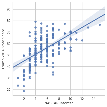
And for NASCAR
In [29]:
g = sns.lmplot(data=nfl_trends, x="NASCAR", y="Trump 2016 Vote%")
g.set_axis_labels("NASCAR Interest", "Trump 2016 Vote Share");
/home/ebenmichael/anaconda3/lib/python3.6/site-packages/matplotlib/font_manager.py:1297: UserWarning: findfont: Font family ['sans-serif'] not found. Falling back to DejaVu Sans
  (prop.get_family(), self.defaultFamily[fontext]))
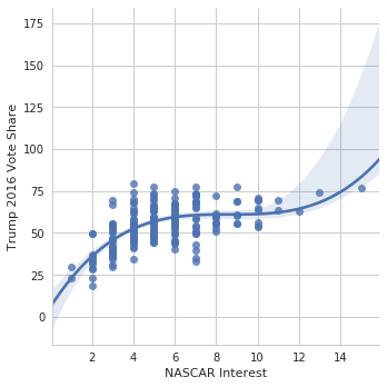
We can also hit higher order models and non-parametric models such as LOWESS
In [30]:
g = sns.lmplot(data=nfl_trends, x="NASCAR", y="Trump 2016 Vote%",
              order=3)
g.set_axis_labels("NASCAR Interest", "Trump 2016 Vote Share");
/home/ebenmichael/anaconda3/lib/python3.6/site-packages/matplotlib/font_manager.py:1297: UserWarning: findfont: Font family ['sans-serif'] not found. Falling back to DejaVu Sans
  (prop.get_family(), self.defaultFamily[fontext]))
In [31]:
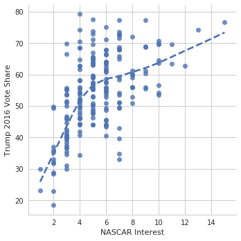
g = sns.lmplot(data=nfl_trends, x="NASCAR", y="Trump 2016 Vote%",
              lowess=True, line_kws={'linestyle':"--"})
g.set_axis_labels("NASCAR Interest", "Trump 2016 Vote Share");
/home/ebenmichael/anaconda3/lib/python3.6/site-packages/matplotlib/font_manager.py:1297: UserWarning: findfont: Font family ['sans-serif'] not found. Falling back to DejaVu Sans
  (prop.get_family(), self.defaultFamily[fontext]))
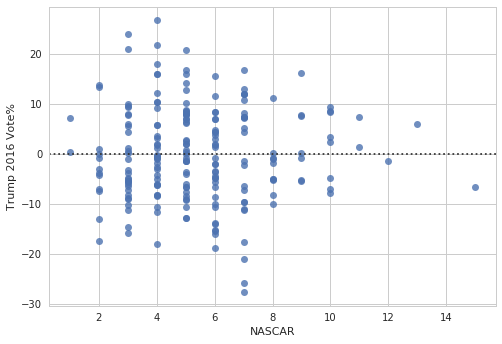
With residplot we can plot the residuals and evaluate the fit.
In [32]:
ax = sns.residplot(data=nfl_trends, x="NASCAR", y="Trump 2016 Vote%",
              order=3)
/home/ebenmichael/anaconda3/lib/python3.6/site-packages/matplotlib/font_manager.py:1297: UserWarning: findfont: Font family ['sans-serif'] not found. Falling back to DejaVu Sans
  (prop.get_family(), self.defaultFamily[fontext]))
We can also fit a logistic regression. Note that it’s more computational expensive than fitting a linear regression.
In [33]:
g = sns.lmplot(data=nfl_trends, x="NASCAR", y="Majority Trump",
              logistic=True, line_kws={'linestyle':"--"}, y_jitter=0.03)
g.set_axis_labels("NASCAR Interest", "Majority Trump");
/home/ebenmichael/anaconda3/lib/python3.6/site-packages/matplotlib/font_manager.py:1297: UserWarning: findfont: Font family ['sans-serif'] not found. Falling back to DejaVu Sans
  (prop.get_family(), self.defaultFamily[fontext]))
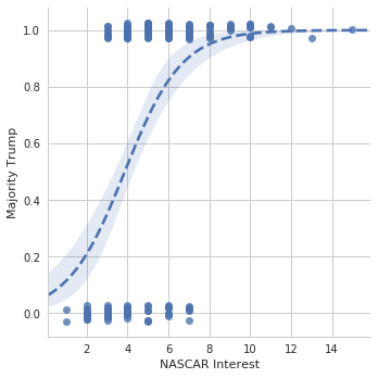
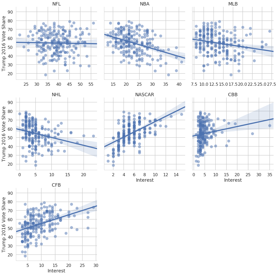
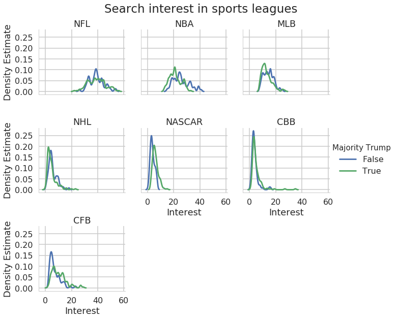
So we see that there’s evidence that NASCAR interest is related to Trump support (why does that make sense?), and there isn’t evidence that NFL interest is related to Trump support. We can look at all the leagues simultaneously.
In [34]:
nfl_melted = nfl_trends.melt(["DMA", "Majority Trump", "Trump 2016 Vote%"])
with sns.plotting_context("poster"):
    g = sns.lmplot(data=nfl_melted, x="value", y="Trump 2016 Vote%",
                  col="variable", col_wrap=3, scatter_kws={"alpha":.5},
                  sharex=False)
    g.set_axis_labels("Interest", "Trump 2016 Vote Share")
    g.set_titles("{col_name}");
/home/ebenmichael/anaconda3/lib/python3.6/site-packages/matplotlib/font_manager.py:1297: UserWarning: findfont: Font family ['sans-serif'] not found. Falling back to DejaVu Sans
  (prop.get_family(), self.defaultFamily[fontext]))
Exercise: Using the NFL fan identification data, create a scatter plot of percent identifying as Republicans vs percent identifying as non-white
In [35]:
### Your code here
Exercise: Now create the same plot where the dependent variable changes from GOP to Dem to Independent
In [36]:
### Your code here
Faceting arbitrary plots
With seaborn we can created faceted plots out of any plot with the
FacetGrid object. Many of the objects that the functions we’ve been
using return are of type FacetGrid. It creates a plot where the
columns and rows are defined as “facets” of the data.
In [37]:
nfl_melted.head()
Out[37]:
| DMA | Majority Trump | Trump 2016 Vote% | variable | value | |
|---|---|---|---|---|---|
| 0 | Abilene-Sweetwater TX | True | 79.13 | NFL | 45.0 |
| 1 | Albany GA | True | 59.12 | NFL | 32.0 |
| 2 | Albany-Schenectady-Troy NY | False | 44.11 | NFL | 40.0 |
| 3 | Albuquerque-Santa Fe NM | False | 39.58 | NFL | 53.0 |
| 4 | Alexandria LA | True | 69.64 | NFL | 42.0 |
In [38]:
with sns.plotting_context("poster"):
    g = sns.FacetGrid(data=nfl_melted, col="variable", col_wrap=3)
/home/ebenmichael/anaconda3/lib/python3.6/site-packages/matplotlib/font_manager.py:1297: UserWarning: findfont: Font family ['sans-serif'] not found. Falling back to DejaVu Sans
  (prop.get_family(), self.defaultFamily[fontext]))
Now we can create a plot on each facet by mapping the plot function across each facet.
In [39]:
with sns.plotting_context("poster"):
    g = sns.FacetGrid(data=nfl_melted, col="variable", col_wrap=3)
    g.map(plt.hist, "value")
/home/ebenmichael/anaconda3/lib/python3.6/site-packages/matplotlib/font_manager.py:1297: UserWarning: findfont: Font family ['sans-serif'] not found. Falling back to DejaVu Sans
  (prop.get_family(), self.defaultFamily[fontext]))
We can provide any of the arguments that seaborn uses (e.g. hue) to
the FacetGrid initialization, and add arguments for the plot when we
map the plotting function.
In [40]:
with sns.plotting_context("poster"):
    g = sns.FacetGrid(data=nfl_melted, col="variable", col_wrap=3,
                      hue="Majority Trump")
    g.map(sns.distplot, "value", hist=False, kde_kws={"bw":.7})
    g.add_legend()
/home/ebenmichael/anaconda3/lib/python3.6/site-packages/matplotlib/font_manager.py:1297: UserWarning: findfont: Font family ['sans-serif'] not found. Falling back to DejaVu Sans
  (prop.get_family(), self.defaultFamily[fontext]))
We can change each plot’s title, the name of the x and y axes, etc.
In [41]:
with sns.plotting_context("poster"):
    g = sns.FacetGrid(data=nfl_melted, col="variable", col_wrap=3,
                      hue="Majority Trump")
    g.map(sns.distplot, "value", hist=False, kde_kws={"bw":.7})
    g.add_legend()
    g.set_axis_labels("Interest", "Density Estimate")
    g.set_titles("{col_name}")
    g.fig.subplots_adjust(top=0.9)
    plt.suptitle("Search interest in sports leagues");
/home/ebenmichael/anaconda3/lib/python3.6/site-packages/matplotlib/font_manager.py:1297: UserWarning: findfont: Font family ['sans-serif'] not found. Falling back to DejaVu Sans
  (prop.get_family(), self.defaultFamily[fontext]))
Exercise: Using the NFL fan identification data, create a plot with kernel density plots of the distribution of GOP, Dem, and Independent support across teams, separating out teams where greater than 75% of fan respondents indentified as white. Facet the rows by party and the columns by greater than 75% white.
In [42]:
### Your code here
Solutions to Quiz 3
Problem 1
Part A (2 points)
Write a function which centers a matrix, i.e. for a matrix \(X \in R^{n\times d}\) with columns \(X_1,\ldots, X_d\), each column should have mean zero
In [43]:
def center(X):
    """Center a matrix X"""
    return(X - X.mean(0))
Part B (2 points)
Write a function which standardizes a matrix, i.e. for a matrix \(X \in R^{n\times d}\) with columns \(X_1,\ldots, X_d\), each column should have mean zero and variance 1
In [44]:
def standardize(X):
    """Standardize a matrix X"""
    return((X - X.mean(0)) / X.std(0))
Part C (2 points)
Write a function which normalizes a matrix, i.e. for a matrix \(X\), with columns \(X_1,\ldots, X_d\), define a new matrix \(\tilde{X}\) such that for each column
In [45]:
def normalize(X):
    """Standardize a matrix X"""
    return((X - X.min(0)) / (X.max(0) - X.min(0)))
Part D (2 points)
Write a functions which takes in a matrix \(X\) and normalizes the rows so that each row has unit norm, i.e. project the rows onto the unit sphere
In [46]:
def project(X):
    """Project rows of X onto the unit sphere"""
    return(X / np.linalg.norm(X, axis=1, keepdims=True))
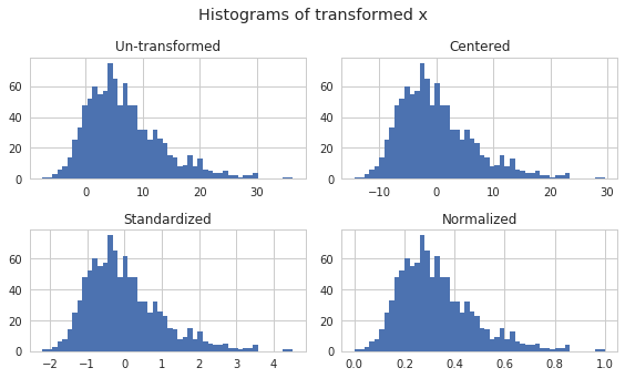
Part E (4 points)
Write a function which takes in a vector \(X\) and plots a histogram
for \(X\), the centered version of \(X\), the standardized
version of \(X\) and the normalized version of \(X\). Be sure to
use one figure and 4 axes. Also create a title for each subplot and one
title for the whole plot. You may find the function
plt.tight_layout() to be useful here.
In [47]:
def plot_transforms(x):
    """Plot histogram of x and transformations"""
    # get figure and axes
    fig, axes = plt.subplots(2, 2, figsize=(8,9/2))

    # first histogram
    axes[0,0].hist(x, bins=50)
    axes[0,0].set_title("Un-transformed")

    # centered
    axes[0,1].hist(center(x), bins=50)
    axes[0,1].set_title("Centered")

    # standardized
    axes[1,0].hist(standardize(x), bins=50)
    axes[1,0].set_title("Standardized")

    # normalized
    axes[1,1].hist(normalize(x), bins=50)
    axes[1,1].set_title("Normalized")

    # sup title
    fig.suptitle("Histograms of transformed x", y=1.05)

    plt.tight_layout()
    return(fig, axes)

np.random.seed(1234)
x = np.random.gumbel(4, 5, 1000)
plot_transforms(x);
/home/ebenmichael/anaconda3/lib/python3.6/site-packages/matplotlib/font_manager.py:1297: UserWarning: findfont: Font family ['sans-serif'] not found. Falling back to DejaVu Sans
  (prop.get_family(), self.defaultFamily[fontext]))
Exercise: Make this same plot using FacetGrid in seaborn
In [48]:
x = np.random.gumbel(4, 5, 1000)
x = pd.DataFrame(x)
x.columns = ["Un-transformed"]
x["Centered"] = center(x["Un-transformed"])
x["Standardized"] = standardize(x["Un-transformed"])
x["Normalized"] = normalize(x["Un-transformed"])
x["id"] = x.index
x.head()
Out[48]:
| Un-transformed | Centered | Standardized | Normalized | id | |
|---|---|---|---|---|---|
| 0 | 7.340602 | -0.060823 | -0.009010 | 0.244636 | 0 |
| 1 | -0.906788 | -8.308213 | -1.230694 | 0.083268 | 1 |
| 2 | 5.612750 | -1.788675 | -0.264956 | 0.210829 | 2 |
| 3 | 1.470330 | -5.931094 | -0.878572 | 0.129779 | 3 |
| 4 | 0.207334 | -7.194091 | -1.065660 | 0.105067 | 4 |
In [49]:
### Your code here
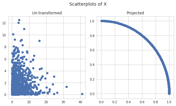
Part F (3 points)
Write a function which takes in a 2 dimensional matrix X, makes a
scatter plot of the rows, and makes a scatter plot of the rows projected
onto the unit circle. Be sure to only create one figure and 2 subplots.
Include a title for each subplot and a title for the whole plot. Again,
the function plt.tight_layout() may be useful here.
In [50]:
def plot_project(X):
    """Plot a scatter plot of X and of the rows projected on to the circle"""

    ### BEGIN SOLUTION
    # get figure and axes
    fig, axes = plt.subplots(1, 2, figsize=(8,9/2))

    # regular
    axes[0].scatter(X[:, 0], X[:, 1])
    axes[0].set_title("Un-transformed")

    # centered
    X_proj = project(X)
    axes[1].scatter(X_proj[:, 0], X_proj[:, 1])
    axes[1].set_title("Projected")


    # sup title
    fig.suptitle("Scatterplots of X", y=1.05)

    plt.tight_layout()
    return(fig, axes)

    ### END SOLUTION

np.random.seed(1234)
x1 = np.random.exponential(4, 1000)
x2 = np.random.chisquare(2, 1000)
X = np.vstack([x1, x2]).T
plot_project(X);
/home/ebenmichael/anaconda3/lib/python3.6/site-packages/matplotlib/font_manager.py:1297: UserWarning: findfont: Font family ['sans-serif'] not found. Falling back to DejaVu Sans
  (prop.get_family(), self.defaultFamily[fontext]))
Problem 2
Part A (5 points)
Write a function which takes in an \(n \times d\) matrix of features \(X\), and an \(n\) dimensional vector of outputs \(y\), and returns the OLS estimate:
Note: Use pure numpy, not a package that computes the OLS for you. The goal here is to perform the linear algebra operations in numpy
In [51]:
def compute_ols(X, y):
    """Computes the OLS estimate of y regressed on X"""
    return(np.linalg.inv( X.T @ X) @ X.T @ y)
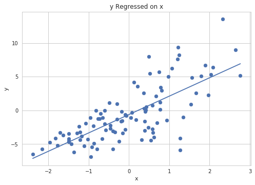
Part B (5 points)
Write a function which takes in an \(n \times 2\) matrix of features \(X\) (a column of 1s and the univariate covariate), and an \(n\) dimensional vector of outputs \(y\), and makes a scatter plot of y on x and plots the line resulting from the least squares estimate. Make sure to label your axes and create a title.
Note: Passing in a matrix with a column of 1s means that the ols estimate will have two parts: the intercept, and the slope. Make sure to incorporate both of these when plotting the least squares regression line
In [52]:
def plot_ols(X, y):
    """Make a scatter plot of y on X"""

    ### BEGIN SOLUTION
    # compute ols
    ols = compute_ols(X, y)

    # start the scatter plot
    plt.scatter(X[:, 1], y)

    # add the regression line
    xmin = X[:, 1].min()
    xmax = X[:, 1].max()

    y_hat_min = ols[0] + ols[1] * xmin
    y_hat_max = ols[0] + ols[1] * xmax

    plt.plot([xmin, xmax], [y_hat_min, y_hat_max])

    plt.xlabel("x")
    plt.ylabel("y")
    plt.title("y Regressed on x")
    ### END SOLUTION

# simulate heterskedastic data
np.random.seed(159)
n = 100
X = np.vstack([np.ones(n), np.random.randn(n)]).T
beta = np.random.laplace(0, 1, 2)
y = X @ beta + np.random.randn(n) * (X[:, 1] - X.min(0)[1])

# plot
plot_ols(X, y)
/home/ebenmichael/anaconda3/lib/python3.6/site-packages/matplotlib/font_manager.py:1297: UserWarning: findfont: Font family ['sans-serif'] not found. Falling back to DejaVu Sans
  (prop.get_family(), self.defaultFamily[fontext]))
Exercise: Create this plot using seaborn
In [53]:
### Your code here